Grades 9-1… a complex picture.
October 30, 2015 2 Comments
Damian Ainscough has written a blog post about the new GCSE grading system.
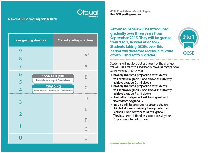
Ofqual have released digital postcards explaining it as well:
And in response to Damian’s question on twitter I had an attempt as well. Firstly I produced this tweet: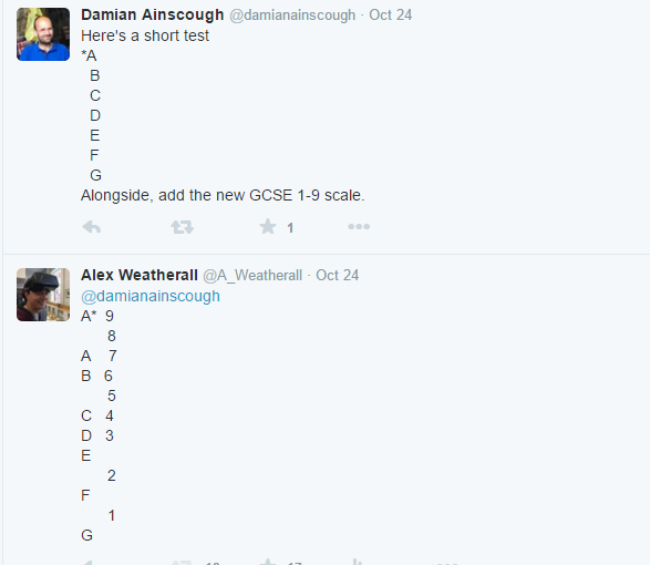
It’s difficult to produce an accurate representation in a tweet, but I gave it a go.
But then I did this

The middle section of this image needs some explanation, meaning that this example is probably too complicated – Damian certainly thought so when I showed him; however I reckon it is worth thinking about.
Ofqual state that broadly the same proportion of students will achieve a grade 4 and above as currently achieve a grade C and above. And the same statement is also used for 7+ and grade A (with the top 20% of those students awarded a grade 9). So I used the 2014 data for Maths and English (2015 is similar, but subtly different – I might redo this image with 2015 results). It is important to note that this is the percentage spread of of results nationally, not a guide for grade boundaries.
I think this image is important as it highlights a few things: for example that the expectation is that roughly the same number of students (perhaps fewer) are expected to get a 9 as the number of students that currently fail their GCSE. And that the new floor grade 5 is a large jump up if your school cohort is similar to the national picture – meeting it is going to be a very big ask if your school cohort results are distributed towards the lower end – remember comparable outcomes means that this spread is also related to the national KS2 data.* ***
Anyway please pick this apart. I produced this visualisation partly to see if it was useful and partly to see if I could**. Let me know via twitter or in the comments.
*Note: this is a fuzzy generalisation based on English and Maths results from 2014 (via Mike Cameron) – your mileage willvary subject by subject and year on year.
** The reason the grades aren’t equally spaced on the left hand side is so that the G1, C4 and A7 points line up. I had originally spaced them equally on both sides. Another visualisation I made last year is a bit simpler but doesn’t display the floor levels

*** I’ve looked into the 2015 and 2014 data and noticed the following: in most subjects roughly 25-30% of students achieve a C so if the bottom of a 5 (the new floor) is going to be the top 3rd of a C, then 17-20% of students will automatically fall through the floor – as the same proportion of students who get a C or above will get a 4 or above. Under the new system up to an extra 1/5 of all students sitting most GCSEs will not get above the floor grade.
Hold the front page: Schools Week already spotted this in June – http://http://schoolsweek.co.uk/grade-changes-set-pupils-up-to-fail-their-gcses/
— Further edit – this one is quite special 🙂
If we look at the Additional Science results we have a further oddity – the plan is for the top 20% of A/A* to get a 9. And so the idea is that A* equivalent students are spread between the top of 8 and the 9 grade but if we look at additional science result A-A* in 2015 add up to 10.8% of students – 20% of that is 2.2% but the number of students with A* s were 1.9% of cohort. So in science we might have the odd situation that we’ll get more students with a 9 than we used to get with an A*. 7 and 8 will just split up the A grade. I don’t think that this was the intention.

